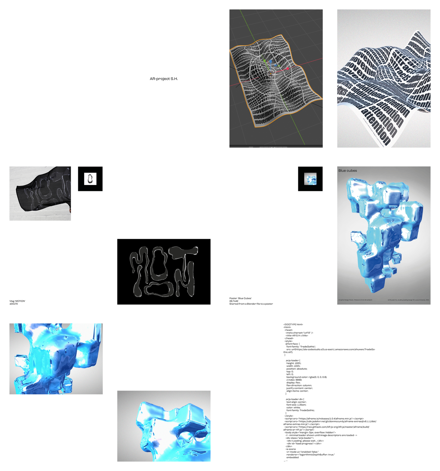
© Animation of small publication AR-site
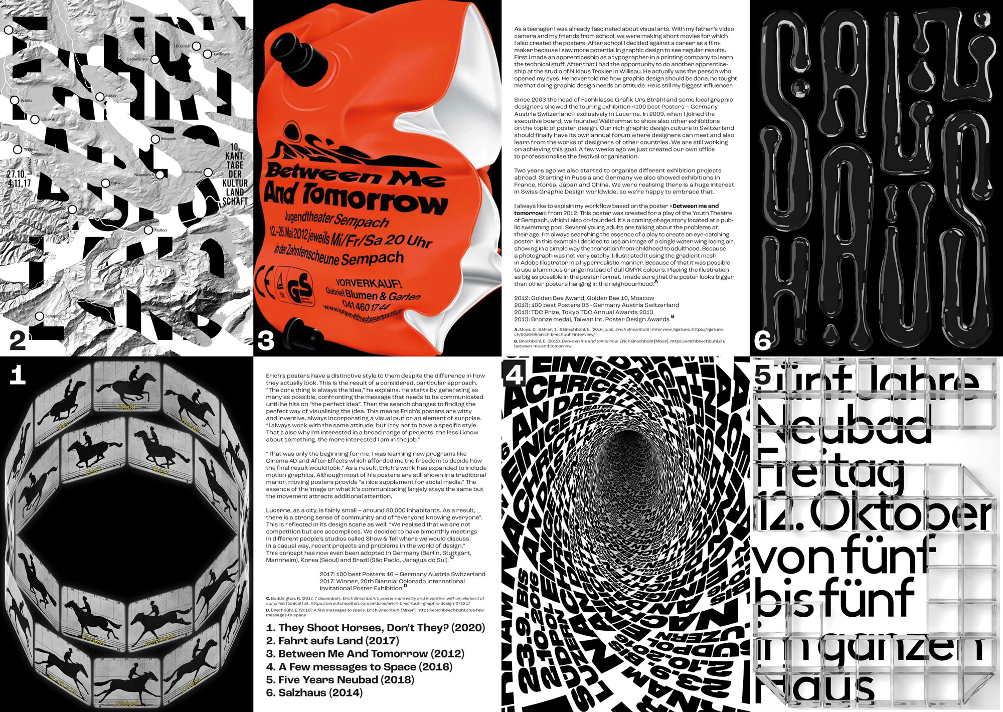
Made in Bachelor 2. The assignment was to choose a graphic designer you find interesting and make a flag, a newspaper, an object and a poster that was based on one of his works.
For this assignment, I chose Erich Brechbühl as my graphic designer. The reason for this choice was because he also works with motion graphics. He designs many posters along with a moving image.
This is why I decided to make a virtual object, instead of a physical object. I coded an Augmented Reality-site, where you have to scan a snippet of an image to see the moving image.
Check the Augmented Reality-site out!
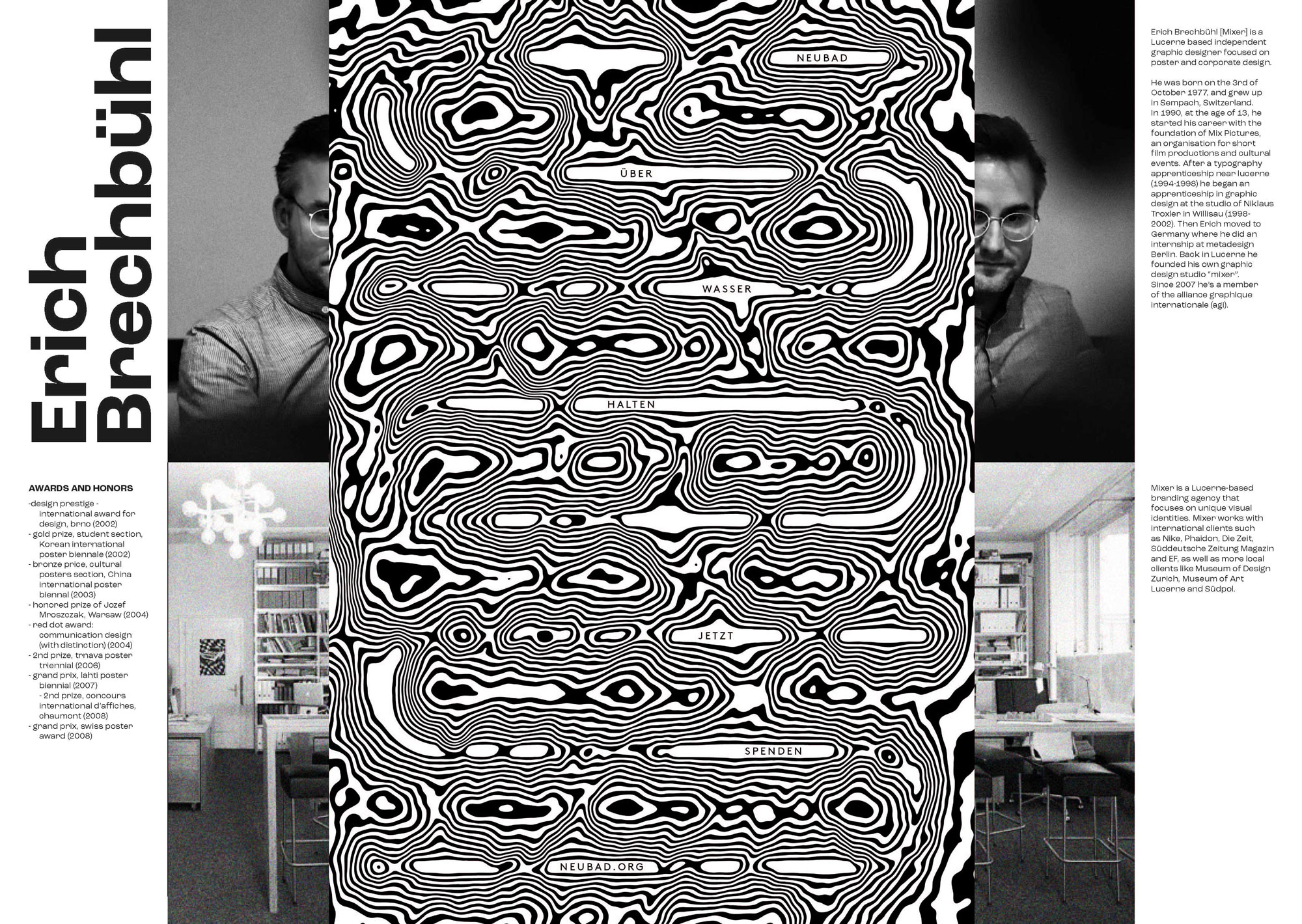
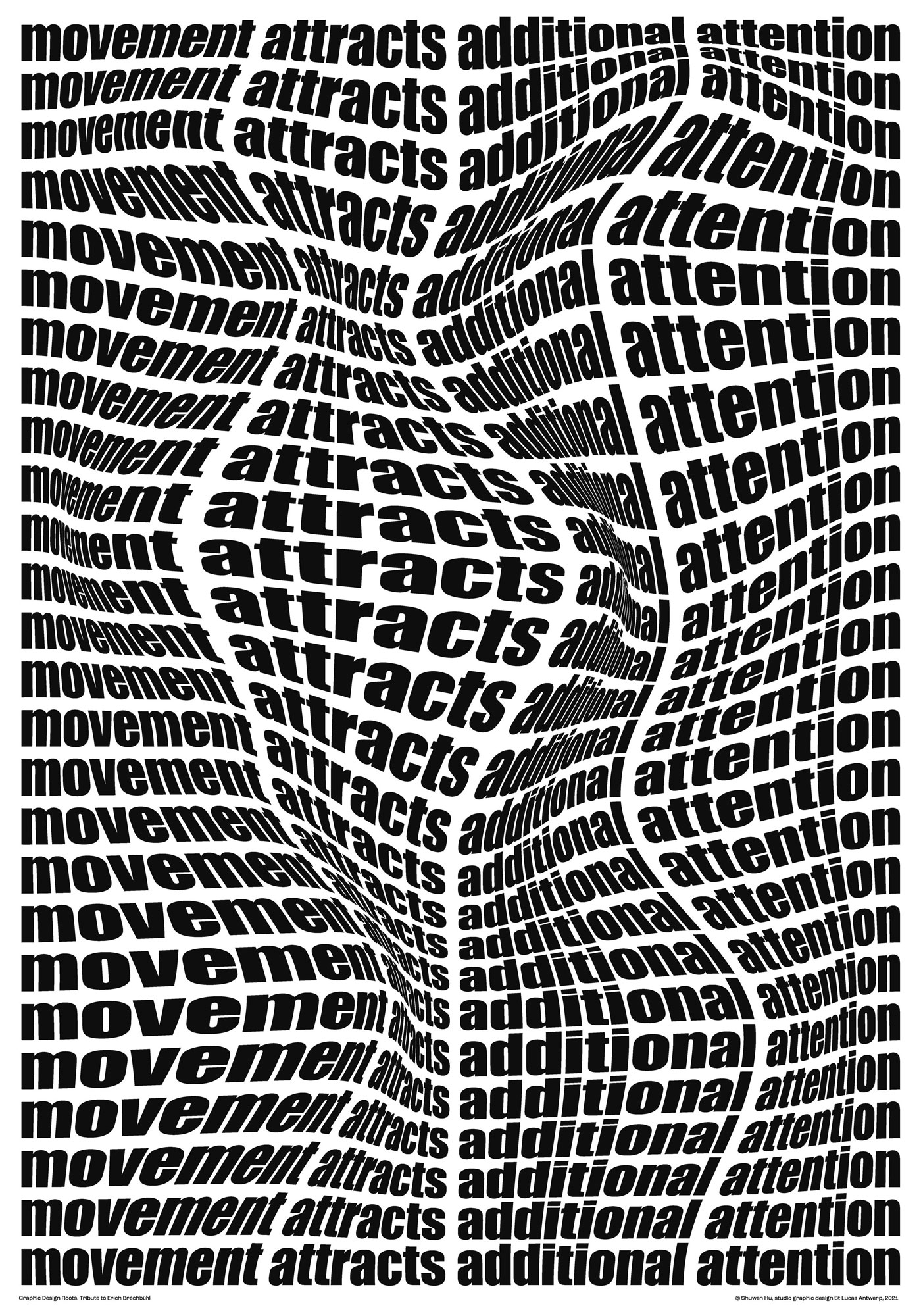
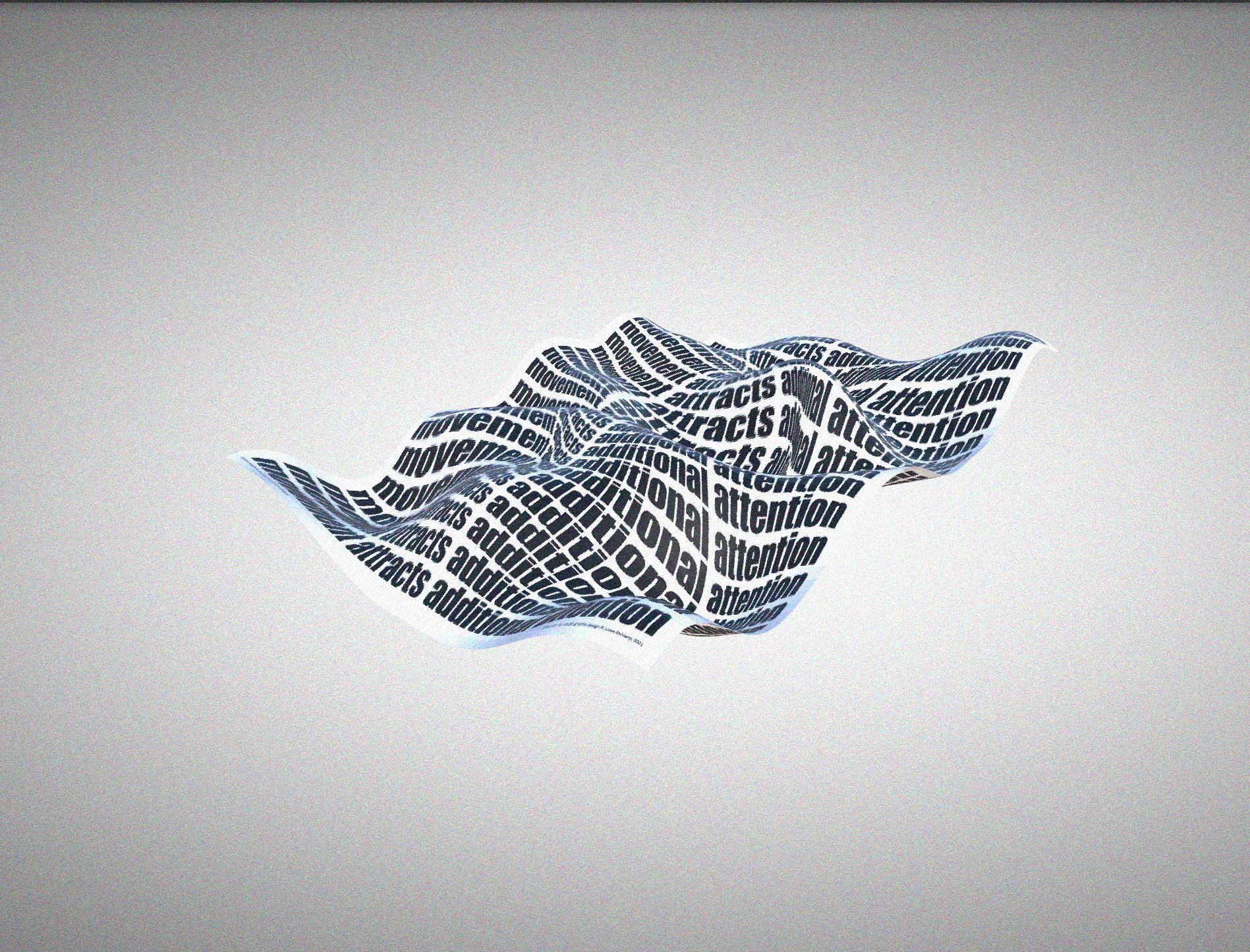
A1 Poster. "Movement attracts additional attention."
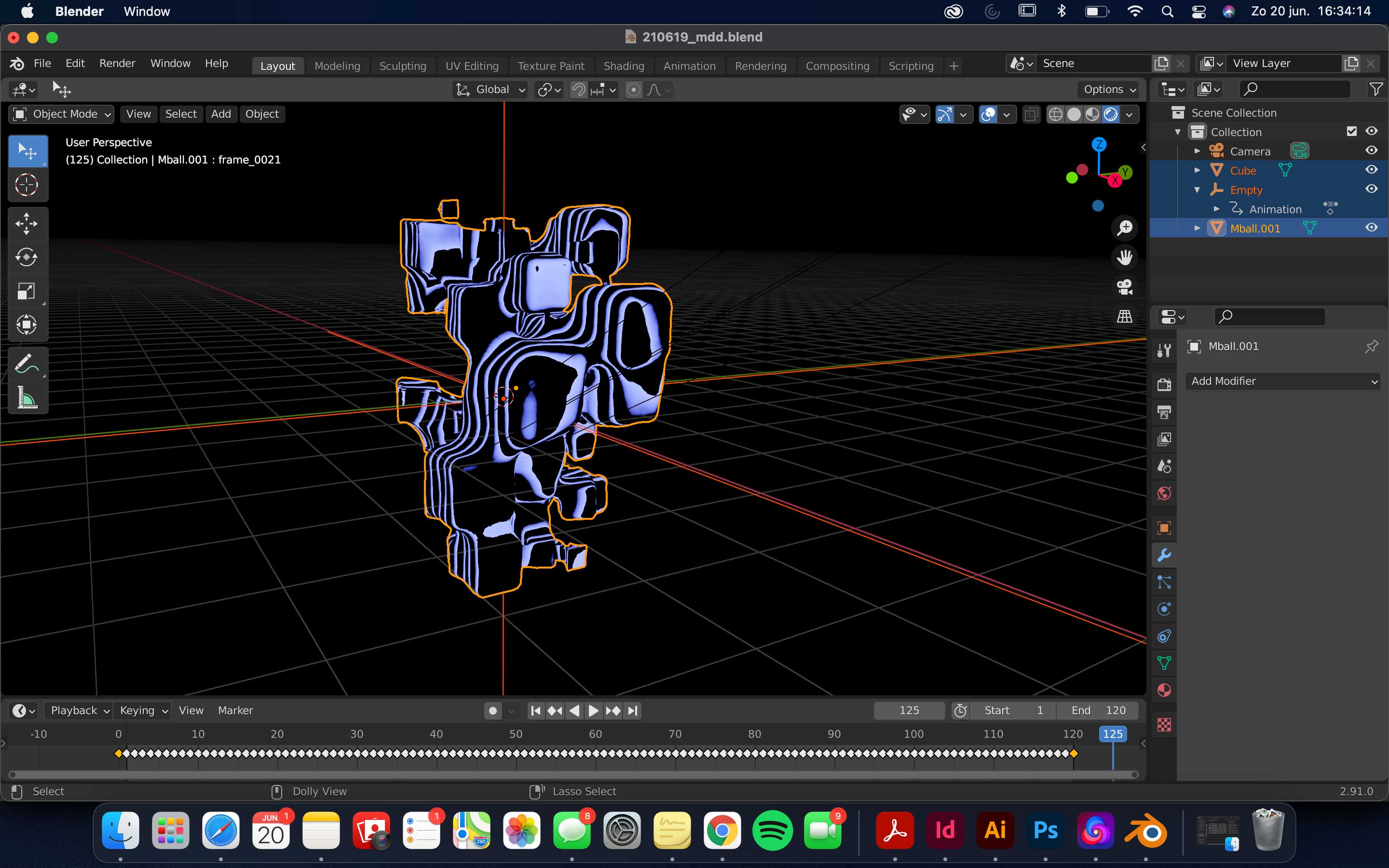
The sentence is a quote of Erich Brechbühl, said in an interview. I wanted to create a poster that doesn't move, but looks like it's moving. With Blender, I made an animation of the poster that is moving, to really accentuate the waves.
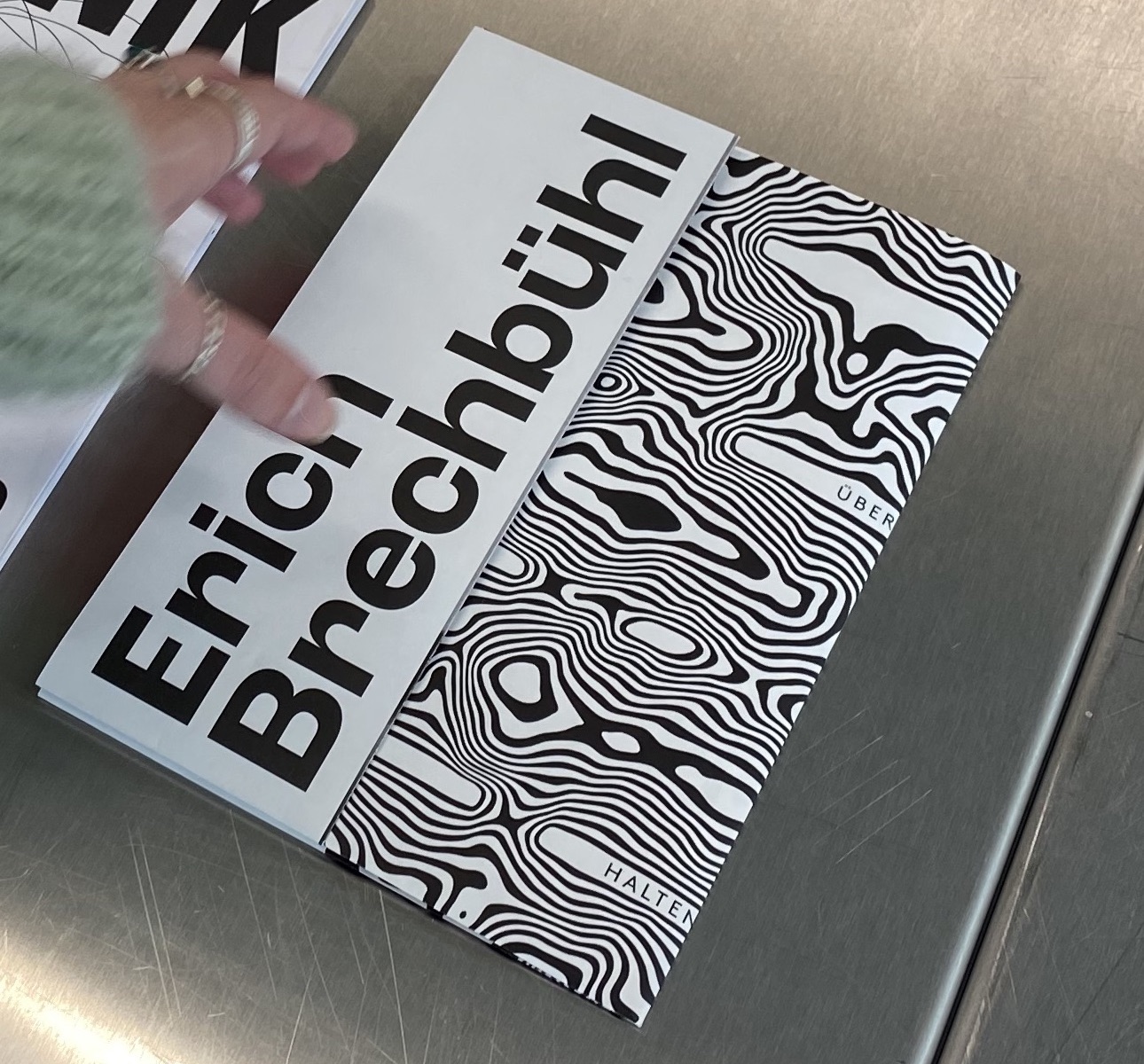
A2 double sided. Pamphlet.
I wanted to highlight the movement once again. That's why I designed a pamplet where you need to interact to see all the contexts of the pamphlet. In the video you can see that you can see it in different ways by how you fold it.
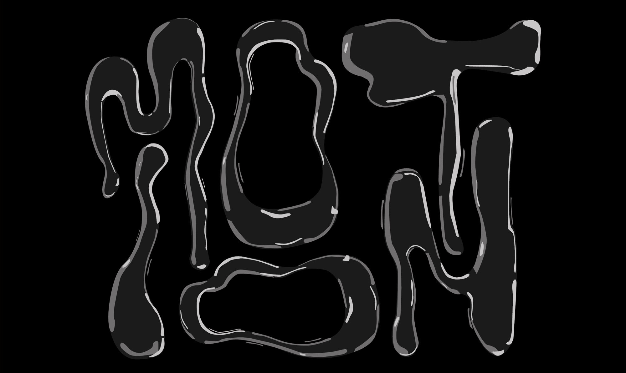
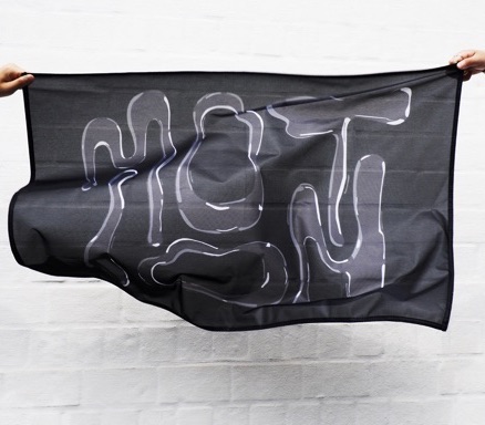
A2 flag. 'Motion'.
Because Erich Brechbühl makes a lot of posters with a lot of movement, I wanted to create the feeling of movement with still forms. That's why I designed a flag with the letters of MOTION in a moving way.
Augmented Reality site. AR-site.
Moving images can't really be shown on paper. This is why I decided to make a virtual object, instead of a physical object. I coded an Augmented Reality-site, where you have to scan a snippet of an image to see the moving image.